The Anatomy of a Design Concession: Apple’s Admission of Failure
The release of iOS 26.2 feels less like a step forward in design philosophy and more like a collective sigh of relief from the design team, having finally conceded that their visual brainchild, ‘Liquid Glass,’ wasn’t exactly a crowd-pleaser and needed to be reined in by user control. Right? For months, perhaps even years, we’ve been subjected to Apple’s unwavering insistence on a specific aesthetic—a hyper-minimalist, often overly-transparent interface that prioritizes form over function. With iOS 26.2, Apple is now allowing users to dial back the transparency of the Lock Screen’s clock, essentially letting us disable the very feature they championed as cutting-edge design. This isn’t innovation; it’s a corporate walk-back wrapped in a press release.
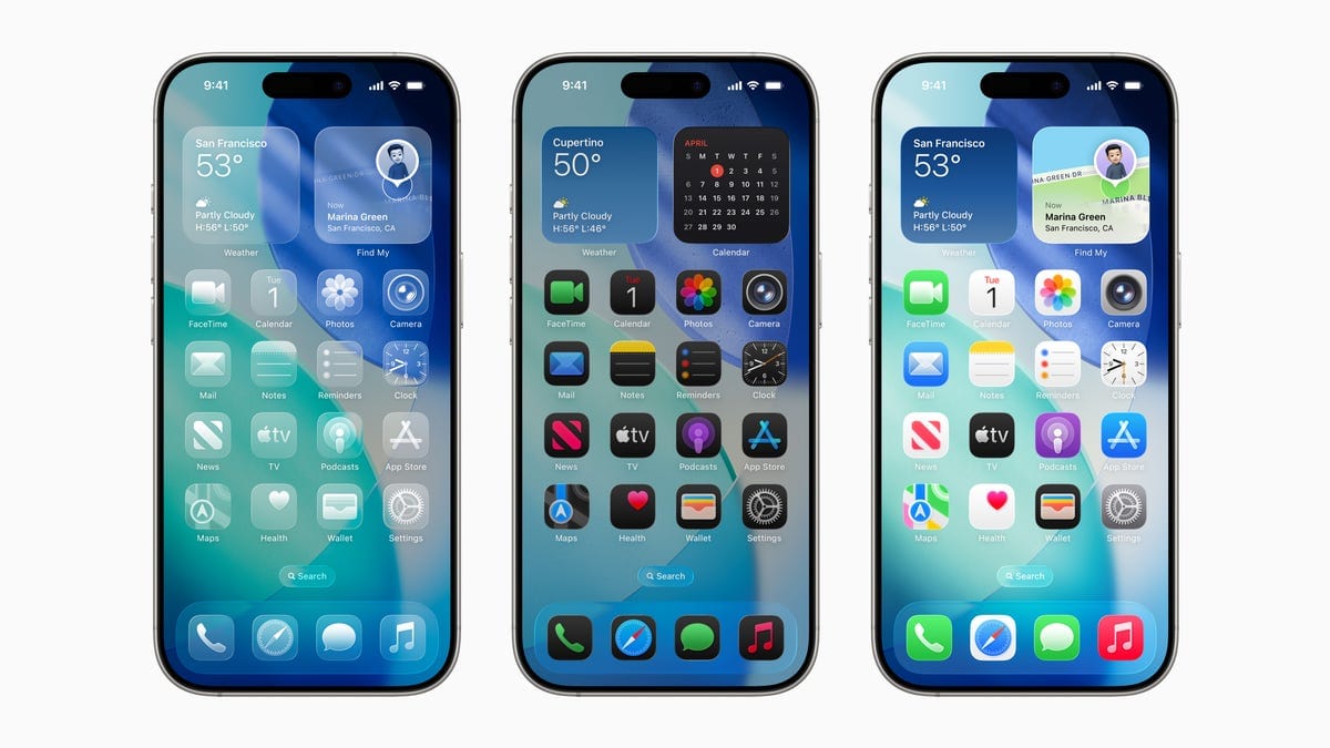
This entire ordeal—from the initial, aggressive rollout of Liquid Glass to the grudging introduction of granular controls to turn it off—serves as a case study in corporate hubris. Apple’s reputation for dictating user taste, a strategy that worked wonders for decades when it resulted in genuinely superior user experiences, has lately devolved into simply forcing users to adapt to questionable aesthetic decisions. The Lock Screen, once a place of utility and quick information access, became a visual struggle for many users due to the high-contrast text battling against the transparent, blurred background. The new Lock Screen design, introduced in iOS 26, was supposed to be a revolution in personalization, offering a canvas for widgets and fonts. Instead, it became a battleground where users fought to make their screens legible against the backdrop of an overly ambitious visual effect. The transparency setting in iOS 26.2 is not a new feature; it is a bandage on a self-inflicted wound.
The Illusion of Choice: When Fixing a Mistake Becomes a Feature
Let’s unpack the core issue here. A truly great design should not require a ‘fix’ to make it usable. The fact that Apple felt compelled to release a tool specifically for reducing the transparency of a core visual element indicates a fundamental misjudgment during the initial design phase. This wasn’t a minor tweak; it was a response to widespread user backlash. The ‘Liquid Glass’ effect, which aims to add depth by subtly blurring the wallpaper behind text and widgets, created significant visual clutter for many users, particularly those with complex or high-contrast backgrounds. The effect, intended to feel sophisticated, often simply looked messy and obscured information. When a user has to actively seek out settings to restore basic legibility, something has gone fundamentally wrong with the design choices. This isn’t a new trend, either; Apple has a history of these post-release concessions, a slow-rolling process of admitting failure without ever actually saying sorry. It’s a passive-aggressive update strategy: they force a design on you, wait for the complaints, and then slowly introduce options to reverse it, presenting a user-led rollback as a new feature.
Consider the broader implications. Apple prides itself on its ‘it just works’ philosophy, where the user shouldn’t need to tinker with settings because the default experience is perfect. This transparency setting shatters that facade. It puts the burden of customization back on the user, forcing them to adjust a feature that never should have been an issue in the first place. The ‘Liquid Glass’ transparency was a design choice intended to unify the aesthetic. By making it adjustable, Apple has effectively fragmented the visual experience of the operating system. What does that say about the leadership of Apple’s design team? Are they so out of touch with real-world usage scenarios that they fail to anticipate basic legibility problems? Or are they simply so stubborn about their creative vision that they’re willing to sacrifice user comfort to maintain an aesthetic trend? The answer is probably a mix of both, but the result is clear: users are tired of being guinea pigs for Apple’s aesthetic experiments. The Edge Light tool, also included in 26.2, is another example of this. It’s a visual gimmick that adds little functional value, a notification flash around the edge of the screen that many Android users have had for years. Apple takes old ideas, polishes them, renames them, and presents them as groundbreaking innovation. But in this case, the ‘innovation’ is fixing their own mistakes. It’s painting lipstick on a pig and calling it a redesign.
The Broader implications: A Sign of Design Stagnation
This episode with Liquid Glass and the subsequent rollback reflects a larger trend of stagnation within Apple’s software design. For years, Apple’s software updates were defined by bold, singular vision. Think of the transition from skeuomorphism to flat design; it was a jarring change for some, but it was decisive and coherent. The modern era of iOS updates, however, feels less like a unified vision and more like feature creep designed to check boxes against competing platforms. The introduction of Lock Screen widgets and now these customization options are fundamentally defensive moves. They acknowledge that Android offers deeper personalization and that a significant portion of the market values that freedom. Apple, while still maintaining its strict control, is slowly loosening its grip. But by doing so reluctantly, it creates a fragmented and inconsistent experience. The very design language of iOS is becoming diluted. We’re getting a mishmash of elements that don’t always coexist harmoniously, all because Apple wants to appease a vocal minority without truly embracing an open-ended design philosophy. This is the hallmark of a company trying to please everyone, and in doing so, pleasing no one completely. This isn’t the Apple of old, which set the standard for elegant, simple software. This is Apple trying to play catch-up while still insisting on its superiority.
The question of why Apple continues down this path of aesthetic-first, function-second design is worth exploring. Is it possible that the new design team, devoid of Jony Ive’s rigid oversight, is overcorrecting in a desperate attempt to differentiate itself visually? The ‘Liquid Glass’ effect is certainly visually distinctive, but its practical value is negligible. It’s a solution looking for a problem. The most likely scenario is that Apple’s internal testing simply isn’t robust enough. They test in a vacuum, with carefully curated backgrounds and optimal lighting, failing to account for real-world scenarios where users have messy photos, bright outdoor environments, or simply prefer a stark, readable interface. The fact that users have clamored for a way to turn this feature off for months speaks volumes. The transparency adjustment in iOS 26.2 is not a new feature; it’s a correction. It demonstrates that Apple’s design philosophy is no longer about setting trends, but about reacting to criticism. This latest update proves that Apple, for all its posturing, is capable of making mistakes and, more importantly, is capable of backtracking on those mistakes when enough users complain. The Edge Light tool and Liquid Glass adjustments in iOS 26.2 show a company grappling with its own identity crisis: a struggle between its legacy of minimalism and the market’s demand for customization, resulting in a confusing, inconsistent user experience. The ‘Liquid Glass’ effect was supposed to be a visual differentiator, a touch of sophistication. Instead, it became an annoyance, and iOS 26.2 is the official admission of that failure. They are trying to give the impression of choice without truly admitting their original design was flawed.
The entire debacle over a simple transparency setting highlights Apple’s current design conundrum. They’re trying to give the user more control—a concession to the Android philosophy—while maintaining the illusion of a curated, Apple-only experience. It’s a delicate balancing act, and they keep fumbling the execution. The new features in iOS 26.2 aren’t innovations; they’re corrections. They represent Apple’s grudging acceptance that its aesthetic vision for iOS 26 was fundamentally flawed. It forces us to ask: what other ‘features’ are simply fixes for pre-existing problems? We’re seeing a pattern of post-release adjustments that undermine the initial design decisions. The ‘Liquid Glass’ transparency was supposed to be a key element of the new Lock Screen identity. Now, with a user setting to disable it, the entire design language feels less cohesive. This is the difference between true design innovation and aesthetic gimmickry. Apple is spending development cycles on visual effects that users actively want to disable. That’s not progress; that’s just poor prioritization gone wrong. When a company’s major update involves adding a toggle to turn off a feature from the last update, you know they’re not really moving forward. They’re just cleaning up their own mess.